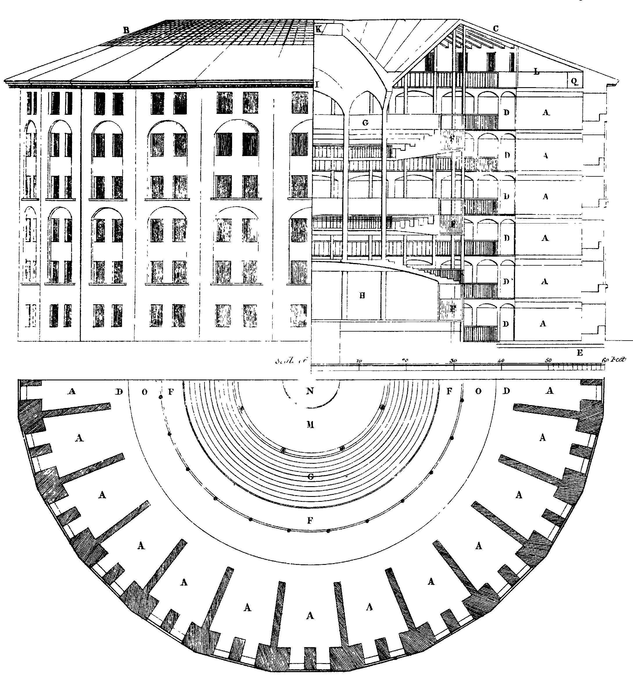
The Panopticon was a prison building that was constructed in such a way, that the prisoners were able to be under surveillance at all times, but they would never know if they were actually being watched, or if no one was in the surveillance tower at all. This design would have bred fear and anxiety amongst the prisoners, and was meant to cease forbidden behaviors and activities. This is an image of Bentham's Panopticon:
Further information on the Panopticons invention is illustrated quite well in this informational video:
With these three sets on Flickr, I wanted to examine critical self-surveillance, an approach that humanizes a source of surveillance, and depersonalizing or dehumanize surveillance. My method was to start with examining the self, turn that into a larger picture by humanizing a normally anonymous entity, and then to abstract that idea of an identity completely.
First, the "Reflections of One's Self" set examines the very human idea of being aware of one's appearance, and attaching identity to one's self through their appearance. This concept became more interesting to me to look at it on a time scale, and to realize that people have used their appearances as a means of identifying who they are, perhaps more so than their personalities, beliefs or actions throughout time. This became more apparent in the context of time due to the the various fashion decades dictating what a person's appearance was. I decided to capture this through the surveillance of one's self by reflections.


For "The Antiquated Watcher", I wanted to form an identity for what the public calls "the man" when referring to the government. The government plays a crucial role the surveillance of civilians, and because the identity of "the man" is obscured by a mask of anonymity, ideas of "the man" can generate fear. I think fear is heightened when a being remains anonymous, because it becomes more of an idea instead of a tangible corporation made of tangible beings (here comes the V for Vendetta comparisons). What kind of retribution can someone get by attacking an idea? This is why I wanted to provide a face to the entity known as "the man". This humanizes that entity, but at the same time, he is portrayed in desolate, lonely and ramshackle locations. This is a comment on "the man" being able to exist in every corner of our imaginations, because of the fear generated by anonymity.


"The Windows" set, in contrast to "The Antiquated Watcher", attempts to portray surveillance again as an anonymous source. By dehumanizing the entity by abstracting their silhouette, it heightens the sense of tension and fear. The pictures show reflections from very domestic locations, such as around a house, to give the sense that you are being watched even from the comfort of your home.


For each set, I used a different technique in editing the photos. for the self-surveillance set I wanted a lost of contrast, and softness to convey a feeling reminiscent of film noir. "The Watcher" set was the most time consuming to edit because I used the same format for editing to create a cohesive esthetic. I wanted an old-world feel, so I added texture and some vignetting, and made all the color palettes subdued and vintage looking. The result was a gritty, antique feel that seemed to bring out the best in each picture. For "The Windows" set, I played a lot with trying to get the pictures to have a green tinge for a sense of unreality, and for a surreal quality. I took an editing cue from film editors after I read on article that pointed out the fact that certain genres of movies have similar color palettes created in post-production. For example, a green tinge conveys a psychological thriller, grays or a desaturated palette seem to be standard for post-apocalyptic worlds, and oranges and teals run rampant in action thrillers. I thought this article was rather hilarious, but also put forth an interesting point- that colors can create the emotional setting or feelings of pictures, and I tried to set that up for each picture to convey what I wanted.

4 comments:
Your photographs are really quite stunning. They show that you have an incredible eye for how to use a camera to portray certain moods and ideas. I especially enjoyed the images the employed the concept of reflection and self-examination.
Did you feel that your three areas of focus supported each other or was there a different direction you hoped to develop in each?. I would image that having three areas of surveilance would enable you to experiement with solid points of view.
I love your photos. The scene, the make-up, the lighting and the photoshop tweak went well together. I think the best one is "The Perception II." The contrast between the two facial expressions radiates a very strange aura. Great job!
Your cinematic vision and level of thought are working well together to convey an emotionality.
Post a Comment